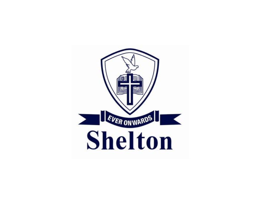
They have been educating private students from Singapore to Nepal to Mongolia, in their own accelerated, quality-assured way for close to two decades now. So the cross, dove and book in their brand identity logo are close to their hearts.
We understood their sentiments but at the same time spared no efforts in understanding their business. Unearthing the wonderful synergy of the three symbols of the cross, dove and book, we re-styled them (thanks Graham, who hand-sketched the very first drawing!) to project our client’s unique value proposition – together they will now take Shelton to new heights, just like the dove which soars above them.


